iOS 8 adds new features that make dealing with screen size and orientation much more versatile. It is easier than ever to create a single interface for your app that works well on both iPad and iPhone, adjusting to orientation changes and different screen sizes as needed.
Using size classes, you can retrieve general information about the size of a device in its current orientation. You can use this information to make initial assumptions about which content should be displayed and how those interface elements are related to each other. Then, use Auto Layout to resize and reposition these elements to fit the actual size of the area provided. Xcode 6 uses size classes and autolayout to create storyboards that adapt automatically to size class changes and different screen sizes.
Traits Describe the Size Class and Scale of an Interface:
Size classes are traits assigned to a user interface element, such as a screen or a view.
There are two types of size classes in iOS 8: regular and compact.
A regular size class denotes either a large amount of screen space, such as on an iPad, or a commonly adopted paradigm that provides the illusion of a large amount of screen space, such as scrolling on an iPhone. Every device is defined by a size class, both vertically and horizontally.
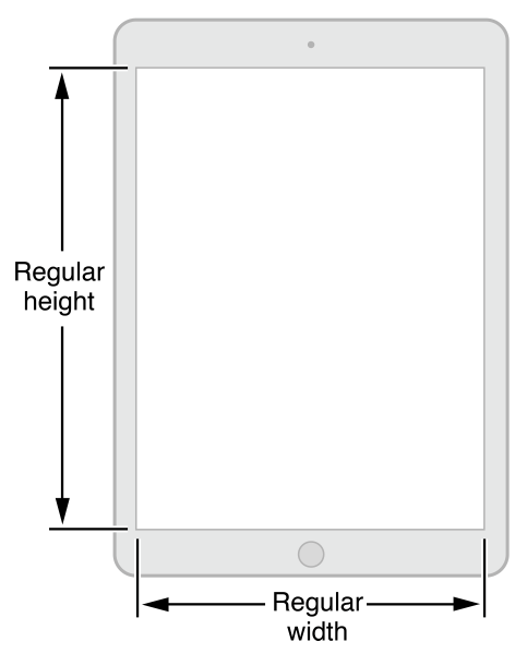
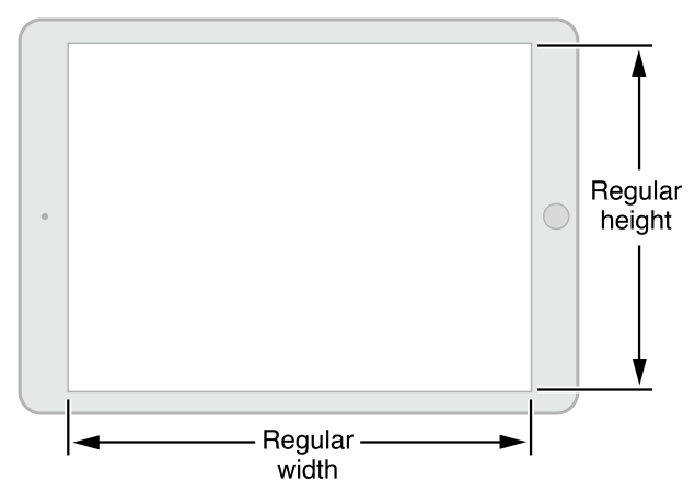
With the amount of screen space available, the iPad has a regular size class in the vertical and horizontal directions in both portrait and landscape orientations.
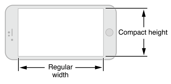
The size classes for iPhones differ based on the kind of device and its orientation.
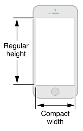
In portrait, the screen has a compact size class horizontally and a regular size class vertically. This corresponds to the common usage paradigm of scrolling vertically for more information.
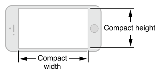
When iPhones are in landscape, their size classes vary. Most iPhones have a compact size class both horizontally and vertically, as shown in Figure 3 and Figure 4.
The iPhone 6 Plus has a screen large enough to support regular width in landscape mode, as shown in Figure 5.
You can change the size classes associated with a view. This flexibility is especially useful when a smaller view is contained within a larger view. Use the default size classes to arrange the user interface of the larger view and arrange information in the subview based on whatever size classes you feel is most appropriate to that subview.
To support size classes, the following classes are new or modified:
- The
UITraitCollectionclass is used to describe a collection of traits assigned to an object. Traits specify the size class, display scale, and idiom for a particular object. Classes that support theUITraitEnvironmentprotocol (such asUIScreen,UIViewControllerandUIView) own a trait collection. You can retrieve an object’s trait collection and perform actions when those traits change. - The
UIImageAssetclass is used to group like images together based on their traits. Combine similar images with slightly different traits into a single asset and then automatically retrieve the correct image for a particular trait collection from the image asset. TheUIImageclass has been modified to work with image assets. - Classes that support the
UIAppearanceprotocol can customize an object’s appearance based on its trait collection. - The
UIViewControllerclass adds the ability to retrieve the trait collection for a child view. You can also lay out the view by changing the size class change through theviewWillTransitionToSize:withTransitionCoordinator:method.